For this project, I reviewed accessibility standards and best practices to enhance email usability. I then took it a step further by styling alt text, ensuring that recipients still had a visually cohesive experience—even when images weren’t downloaded by their email clients.
style="display:block; border:0; font-family:'SoDo Sans', Avenir, 'Roboto', Helvetica, Arial, sans-serif; font-size:21px; font-weight:bold; color:#1e3932; letter-spacing:1px; text-align:center;" alt="STARBUCKS®" title="STARBUCKS®"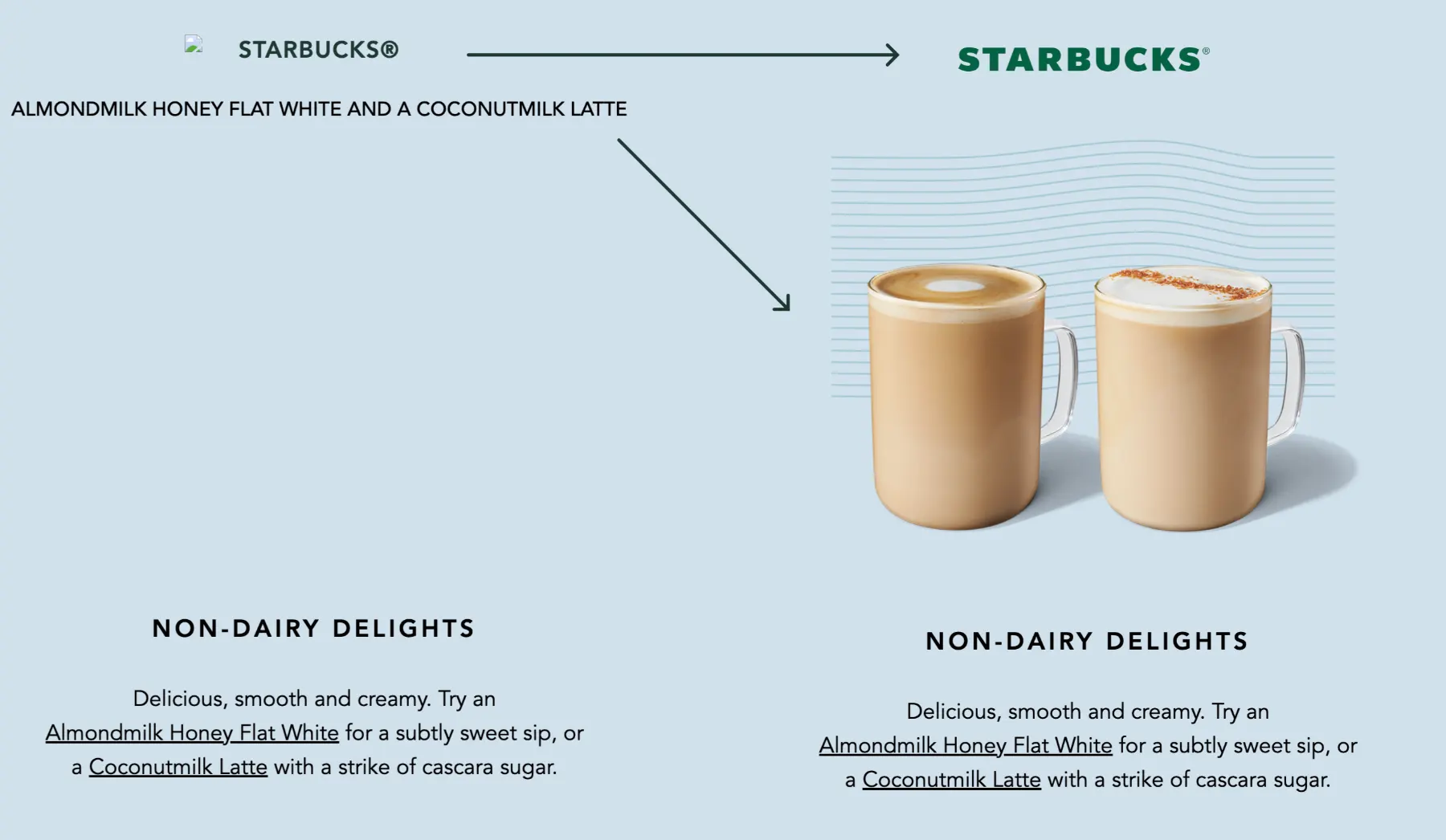
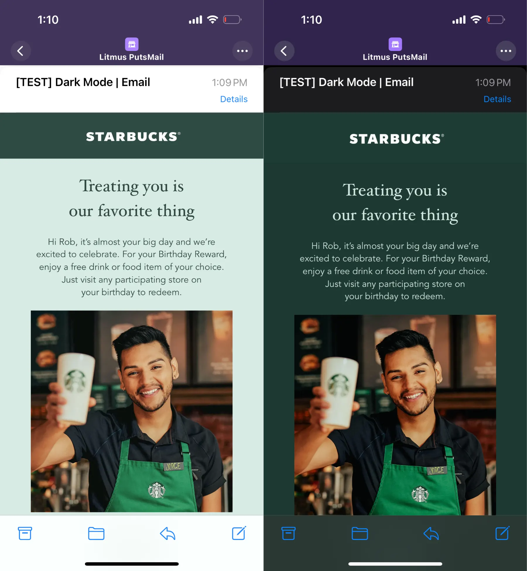
This POC was created to explore the support for Dark mode across different platforms.
This technique is more suited for Email campaigns that have a defined structure and static layout.
While color schemes are supported by iOS only, there are some optimizations that can be implemented to mitigate undesired results for other email clients.
@media (prefers-color-scheme: light)
@media (prefers-color-scheme: dark )Rounded corner buttons fully compatible with Outlook and dark mode optimized. Using just HTML and CSS.

As part of a R&D team I've spent quite some time working and testing new mobile experiences.
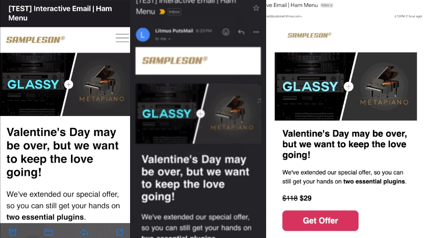
I can craft beautifully interactive emails with <form>...YES! Can you believe it!? And of course the appropriate fallbacks for email clients that do not support this.
<input type="checkbox" id="navbar-checkbox" class="navbar-checkbox" /> <label for="navbar-checkbox" class="menu" style="padding-top: 8px;"> </label> <label for="navbar-checkbox" class="close" style="padding-top: 8px;">With so many different email clients, testing is a critical aspect of email development that should never be overlooked.
Over the years, I’ve spent countless hours troubleshooting complex issues—sometimes real nightmares—that pushed me to explore unconventional testing methods alongside industry-standard tools like Litmus, Everest, and Email on Acid.
I take a deep-dive approach, leveraging developer tools, code inspectors, and other resources to analyze processed HTML and pinpoint rendering issues.
While email client support has improved, limitations still exist, making it essential to account for edge cases. Collaborating closely with designers ensures optimal compatibility and a seamless experience across all platforms.